Warning: realpath(): open_basedir restriction in effect. File(/home/platne/serwer404358/public_html/autoinstalator/mhyrlik.pl) is not within the allowed path(s): (/home/platne/serwer404358/public_html/autoinstalator/mhyrlik.pl/wordpress144116/:/home/platne/serwer404358/tmp/:/home/virtuals/mhyrlik.pl/:/usr/local/php84-fpm/lib/php/:/tmp:/home/tmp:/var/lib/php5) in /home/platne/serwer404358/public_html/autoinstalator/mhyrlik.pl/wordpress144116/wp-content/plugins/wp-file-manager/classes/backup-storage.php on line 119

Warning: realpath(): open_basedir restriction in effect. File(/home/platne/serwer404358/public_html/autoinstalator) is not within the allowed path(s): (/home/platne/serwer404358/public_html/autoinstalator/mhyrlik.pl/wordpress144116/:/home/platne/serwer404358/tmp/:/home/virtuals/mhyrlik.pl/:/usr/local/php84-fpm/lib/php/:/tmp:/home/tmp:/var/lib/php5) in /home/platne/serwer404358/public_html/autoinstalator/mhyrlik.pl/wordpress144116/wp-content/plugins/wp-file-manager/classes/backup-storage.php on line 119

Warning: realpath(): open_basedir restriction in effect. File(/home/platne/serwer404358/public_html) is not within the allowed path(s): (/home/platne/serwer404358/public_html/autoinstalator/mhyrlik.pl/wordpress144116/:/home/platne/serwer404358/tmp/:/home/virtuals/mhyrlik.pl/:/usr/local/php84-fpm/lib/php/:/tmp:/home/tmp:/var/lib/php5) in /home/platne/serwer404358/public_html/autoinstalator/mhyrlik.pl/wordpress144116/wp-content/plugins/wp-file-manager/classes/backup-storage.php on line 119

Warning: realpath(): open_basedir restriction in effect. File(/home/platne/serwer404358) is not within the allowed path(s): (/home/platne/serwer404358/public_html/autoinstalator/mhyrlik.pl/wordpress144116/:/home/platne/serwer404358/tmp/:/home/virtuals/mhyrlik.pl/:/usr/local/php84-fpm/lib/php/:/tmp:/home/tmp:/var/lib/php5) in /home/platne/serwer404358/public_html/autoinstalator/mhyrlik.pl/wordpress144116/wp-content/plugins/wp-file-manager/classes/backup-storage.php on line 119

Warning: realpath(): open_basedir restriction in effect. File(/home/platne) is not within the allowed path(s): (/home/platne/serwer404358/public_html/autoinstalator/mhyrlik.pl/wordpress144116/:/home/platne/serwer404358/tmp/:/home/virtuals/mhyrlik.pl/:/usr/local/php84-fpm/lib/php/:/tmp:/home/tmp:/var/lib/php5) in /home/platne/serwer404358/public_html/autoinstalator/mhyrlik.pl/wordpress144116/wp-content/plugins/wp-file-manager/classes/backup-storage.php on line 119

Warning: realpath(): open_basedir restriction in effect. File(/home) is not within the allowed path(s): (/home/platne/serwer404358/public_html/autoinstalator/mhyrlik.pl/wordpress144116/:/home/platne/serwer404358/tmp/:/home/virtuals/mhyrlik.pl/:/usr/local/php84-fpm/lib/php/:/tmp:/home/tmp:/var/lib/php5) in /home/platne/serwer404358/public_html/autoinstalator/mhyrlik.pl/wordpress144116/wp-content/plugins/wp-file-manager/classes/backup-storage.php on line 119
Premium WooCommerce Purchase Flow - Mateusz Hyrlik | Projektowanie stron www

UX/UI Case Study

Premium WooCommerce
Purchase Flow

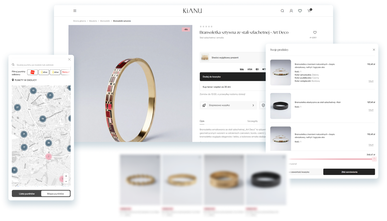
I redesigned and implemented key parts of a live jewellery e-commerce store, focusing on product discovery, gift personalisation, cart clarity, delivery selection and a more guided checkout experience.

01 / PROJECT CONTEXT

Project Overview

KIANU is a jewellery e-commerce store built on WordPress, WooCommerce, Elementor and WoodMart. The store was already live, but the client wanted its shopping experience to feel less generic and more consistent with a premium jewellery brand.

My work focused on several high-impact areas of the purchase journey: product discovery, gift personalisation, cart and mini cart, delivery selection and checkout.

Instead of redesigning the entire store from scratch, I refined the moments where users search for products, review their selections and make key purchase decisions.

02 / PROBLEM

The Challenge

KIANU was already operating as a live WooCommerce store, but selected parts of the shopping experience still felt generic and did not fully reflect the character of a premium jewellery brand.

01

Template-based experience

The store was functional, but key areas still resembled a standard WooCommerce setup and needed a more refined visual direction.

02

Dense purchase flow

Cart, delivery and payment information competed for attention, making the path to completing an order harder to scan.

03

Complex gift options

Dedication, packaging and ribbon options had to remain accessible without overwhelming the product page with additional controls.

04

Existing constraints

Every improvement had to work with the existing theme, plugins, WooCommerce logic and live production environment.

03 / MY ROLE

From Design Decisions to Implementation

I worked across both UX/UI design and implementation. My role was to translate the client’s expectations into practical improvements that could be introduced safely within the existing WooCommerce store.

Selected solutions were explored in Figma, while smaller interface refinements were designed and tested directly during implementation. This allowed me to adjust the experience to real content, responsive behaviour and technical limitations.

01

UX/UI direction

Improving information hierarchy, shopping decisions and visual consistency across key parts of the purchase journey.

02

Interaction design

Designing interface states for gift personalisation, product discovery, cart actions and delivery selection.

03

Responsive implementation

Implementing and refining solutions using WordPress, WooCommerce, Elementor, WoodMart and custom front-end adjustments.

04

Ongoing collaboration

Working directly with the store owner to turn business needs and quality expectations into production-ready improvements.

PROJECT CONSTRAINTS

Designing inside a live e-commerce ecosystem

Existing WooCommerce structure and store logic

Compatibility with the WoodMart theme and active plugins

Changes introduced without rebuilding the entire store

Production stability across desktop and mobile devices

04 / DESIGN DIRECTION

A Clearer Experience With a Premium Character

The redesign was guided by a small set of principles that helped maintain consistency across product discovery, personalisation, cart, delivery and checkout.

The aim was to reduce interface noise while preserving the elegant and restrained character of the KIANU brand.

01

Clear visual hierarchy

Make the most important information and primary actions easier to identify at every stage of the purchase journey.

02

Progressive disclosure

Show additional options, such as gift personalisation, only when users need them instead of displaying every control at once.

03

Consistent interactions

Use repeatable layouts, selection states and action styles across the cart, delivery and checkout to reduce uncertainty.

04

Premium without friction

Keep the interface calm and refined while ensuring that visual minimalism does not hide important shopping information.

These principles became the foundation for the individual improvements presented in the following sections.

05 / PRODUCT DISCOVERY

Making Products Easier to Discover

Product discovery was designed to help users move naturally between browsing, searching and exploring related products without losing context.

Search results, suggested phrases and product recommendations were brought together in one consistent discovery layer.

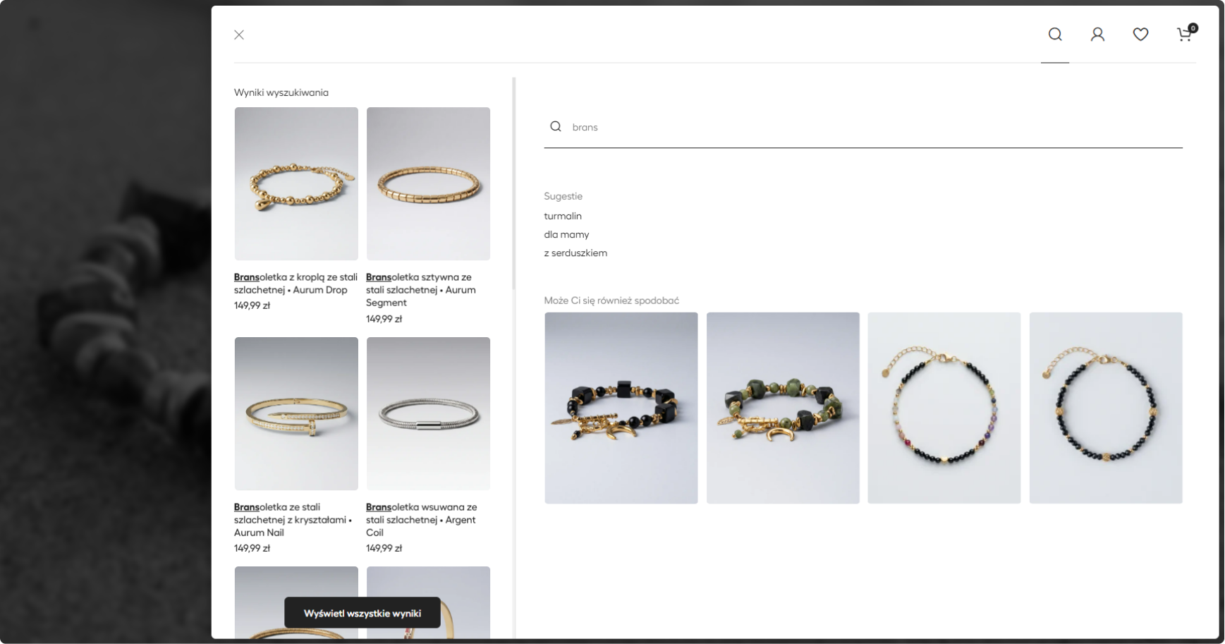
EXPANDED SEARCH

Matching products, suggested phrases and recommendations are available without taking the user away from the current context.

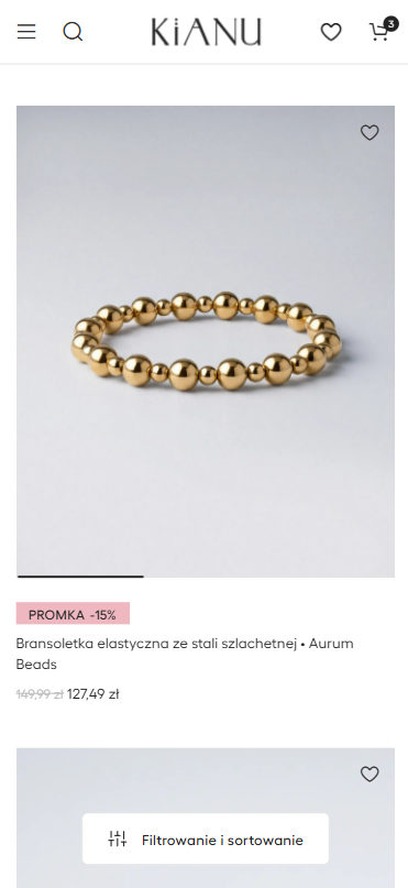
PRODUCT LISTING

Large product imagery and restrained interface elements keep
attention on the jewellery while filtering remains accessible.

01

Search without interruption

Users can review matching products without immediately leaving the page or losing access to the main store navigation.

02

Support before a full query

Suggested phrases and recommendations help users who know what type of jewellery they want but have not selected a specific item yet.

03

Clear path to more results

A dedicated action connects the search preview with the complete results page when users want to explore more options.

06 / GIFT PERSONALISATION

Adding Choice Without Adding Clutter

Gift personalisation was an important part of the shopping experience, but displaying every available option directly on the product page would add visual noise and compete with the primary purchase action.

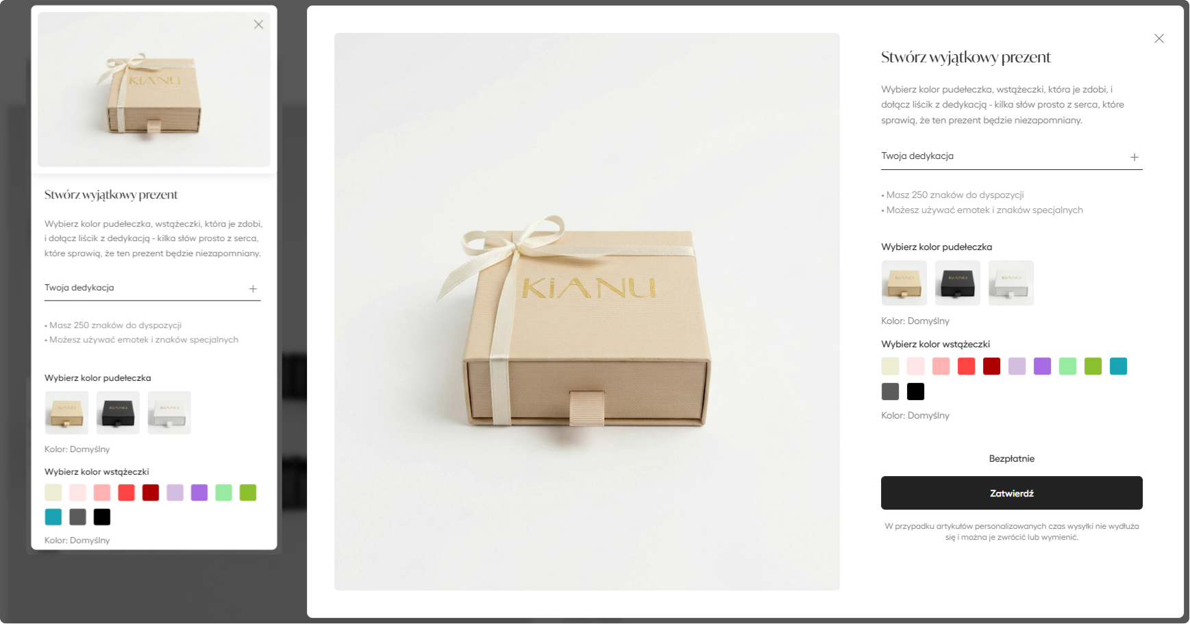
I moved the personalisation controls into a dedicated popup opened from a single action on the product page. Users can add a dedication, choose the box and ribbon colours, and confirm their selections without losing the product context.

DESIGN PRINCIPLE

Progressive disclosure

Additional choices appear only after the user expresses an interest in personalising the gift. This keeps the default product page focused while preserving access to the complete set of options.

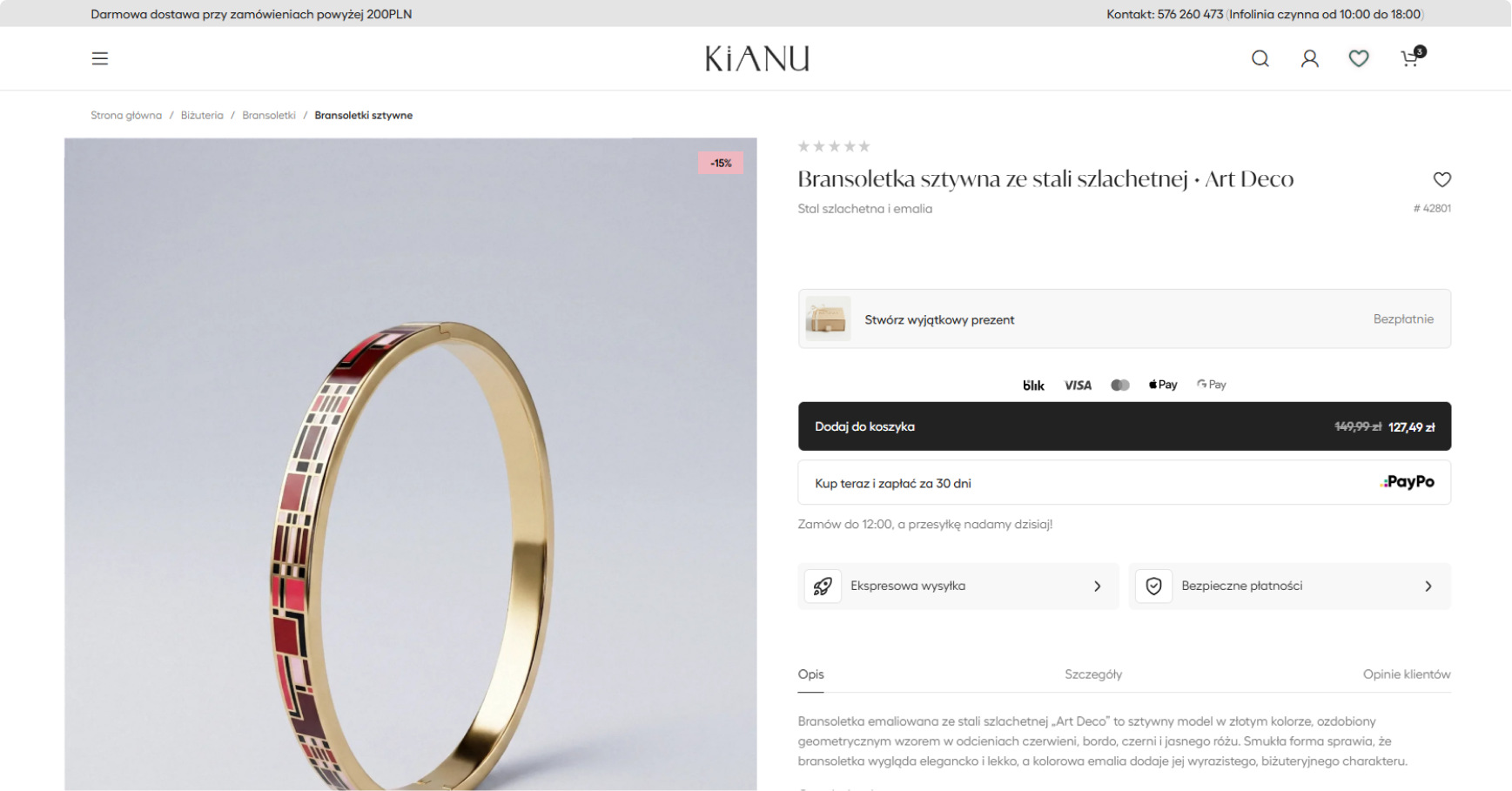
Personalisation entry point

A single secondary action keeps the product page focused while making gift options easy to access.

Focused personalisation flow

The personalisation interface adapts to desktop and mobile while preserving the same options, hierarchy and confirmation flow.

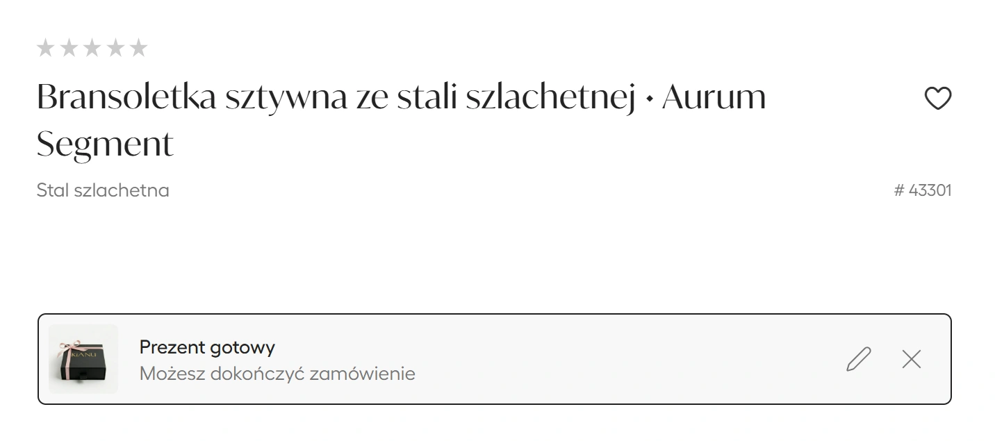
Confirmed personalisation state

The completed state summarises the selection and gives users clear options to edit or remove it before adding the product to the cart.

01

Invite to personalise

A single secondary action introduces gift personalisation without competing with the main add-to-cart button.

02

Configure the gift

The popup groups the dedication, box and ribbon options into one focused task with an immediate visual preview.

03

Confirm or edit

After confirmation, the product page displays a compact completed state with clear options to edit or remove the personalisation.

RESULT

The complete feature remains accessible while the default product page stays focused on the product and the primary purchase action.

07 / CART EXPERIENCE

A Clearer Path From Selection to Checkout

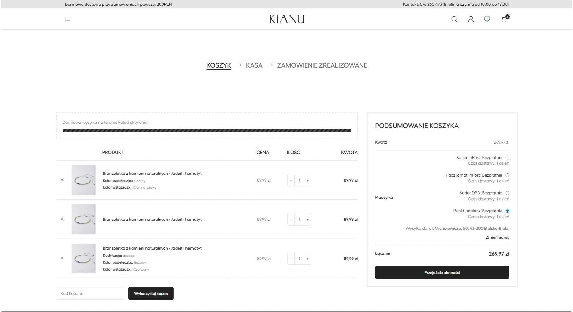
The original cart was functional, but its table-based structure required users to scan across multiple columns. Product details, delivery choices and order information were also distributed across several interface areas.

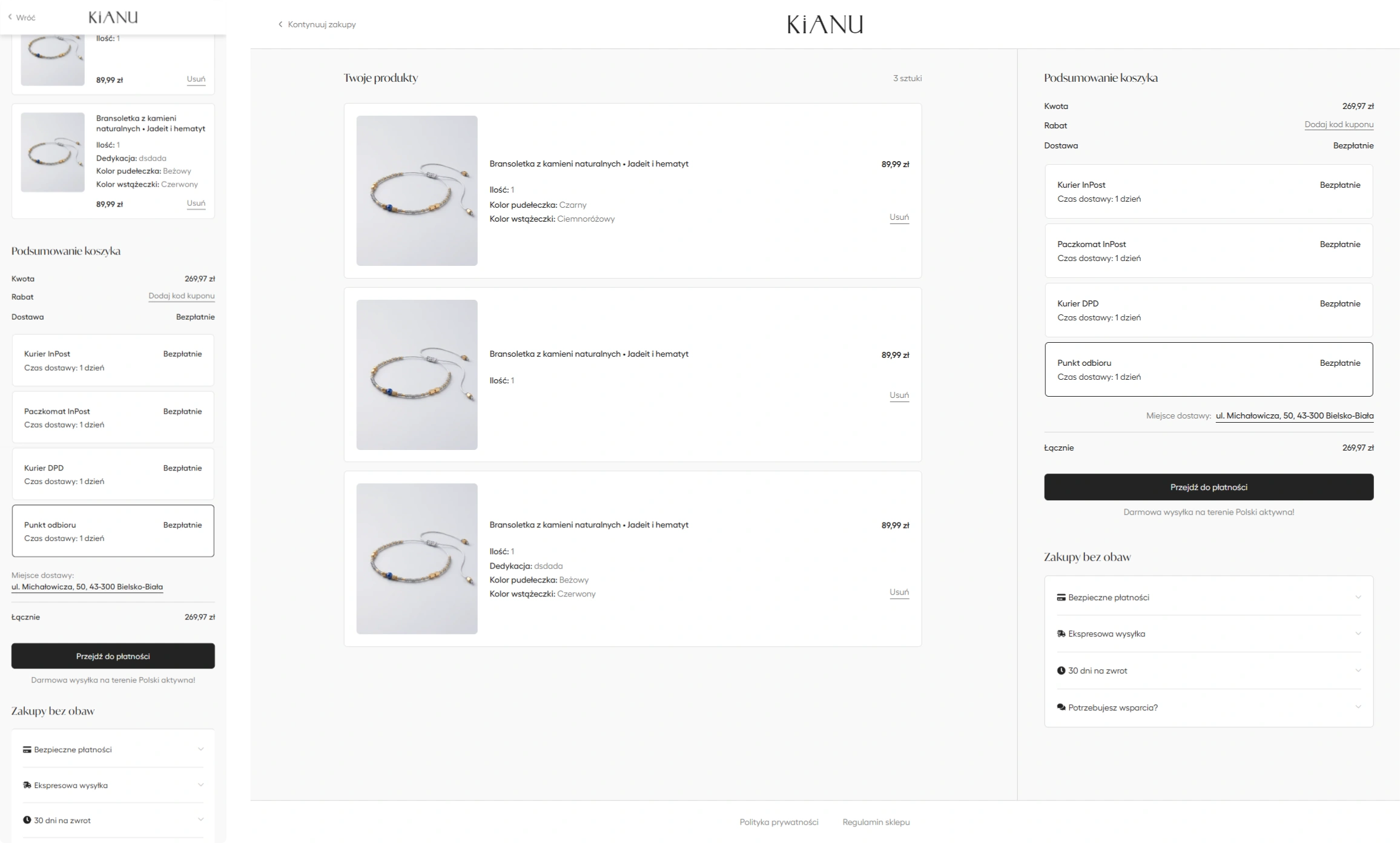
I reorganised the experience around clearer product summaries, visible selections and a more focused order summary that supports the next purchase decision.

BEFORE

Functional WooCommerce layout with dense information.

AFTER

Clearer hierarchy and a more product-focused structure.

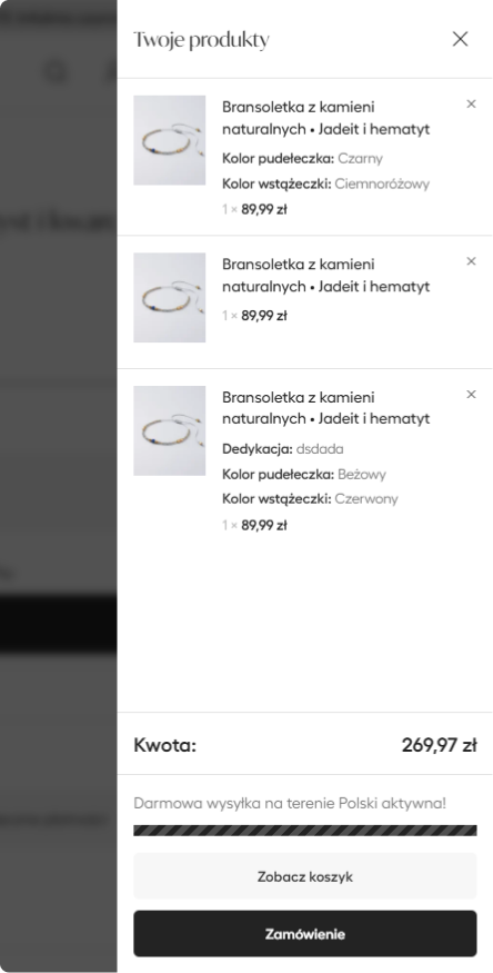
Mini cart before

Basic order preview

Mini cart after

Clear product details and primary action

Cart before

Traditional table-based layout

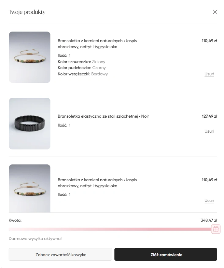
Cart after (mobile and desktop view)

Product-focused cart and consolidated summary

01

Product-focused layout

Each product is presented as a separate unit with its image, selected options, price and remove action grouped together.

02

Consolidated summary

Costs, discounts, delivery options and the primary checkout action are grouped within one consistent order summary.

03

Visible delivery decision

Available delivery methods and the selected destination remain visible before users continue to checkout.

04

Responsive product cards

On mobile, product details are reorganised into compact cards instead of compressing the desktop table into a narrow viewport.

DESIGN OUTCOME

The redesigned cart makes selected products, delivery choices, total cost and the next action easier to review before entering checkout.

08 / CHECKOUT FLOW

Turning a Dense Checkout Into a Guided Purchase Flow

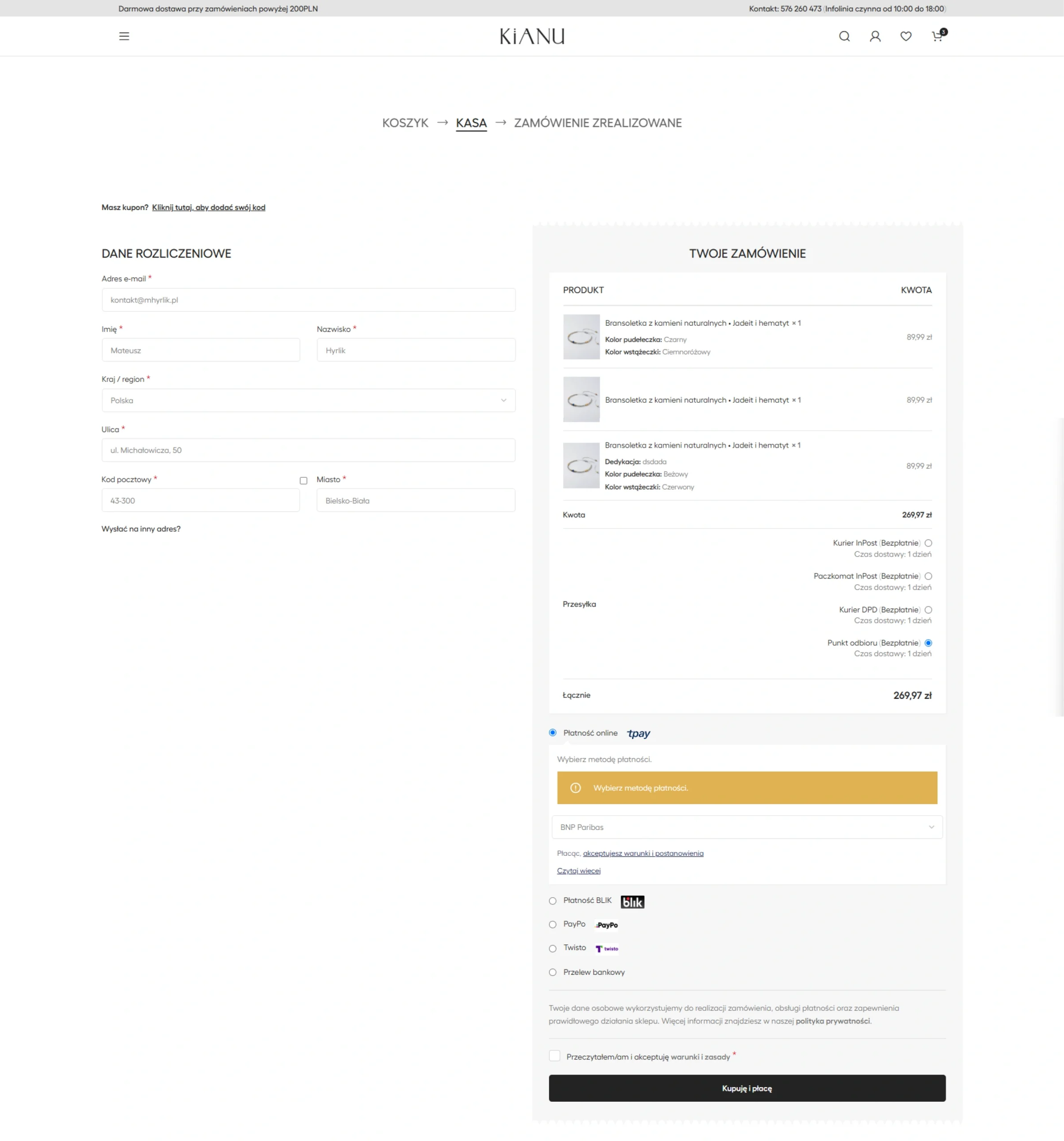
The original checkout presented billing details, delivery options, payment methods, order information and required confirmations within one long view. Although functional, the interface required users to process many decisions at the same time.

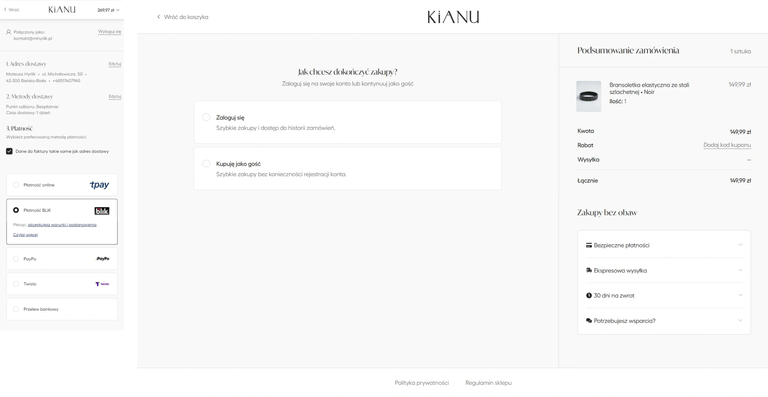
I reorganised the checkout into a sequence of focused stages. Each screen supports one main decision while the order summary remains available as a consistent point of reference.

BEFORE

Everything presented at once

Customer details, shipping, payment and confirmation competed for attention within one extended checkout page.

AFTER

One primary decision at a time

The redesigned experience separates account, address, delivery and payment decisions into clearer stages.

Checkout before

Single-page checkout

Checkout after (mobile and desktop view)

Account or guest checkout

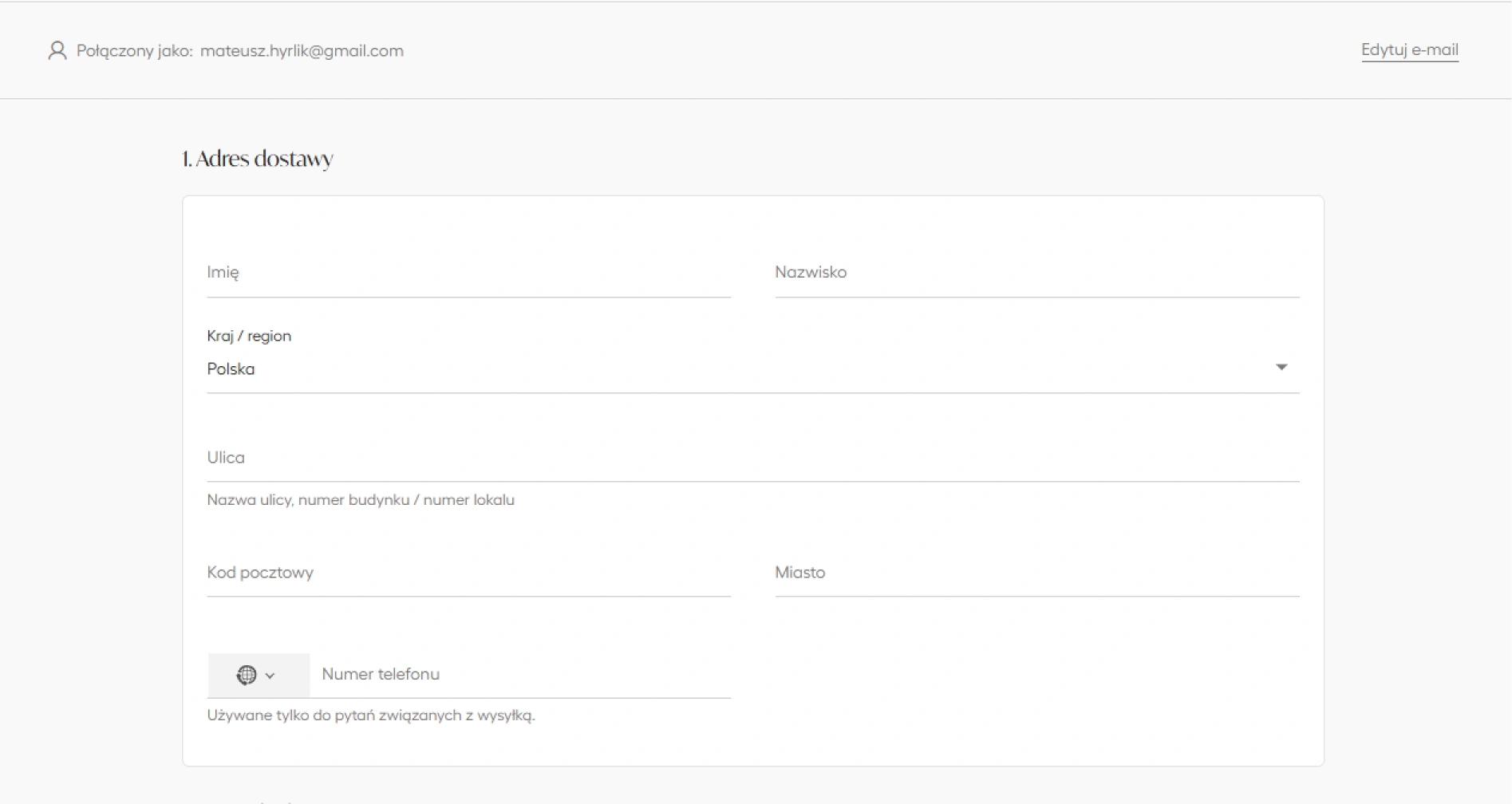
Delivery details

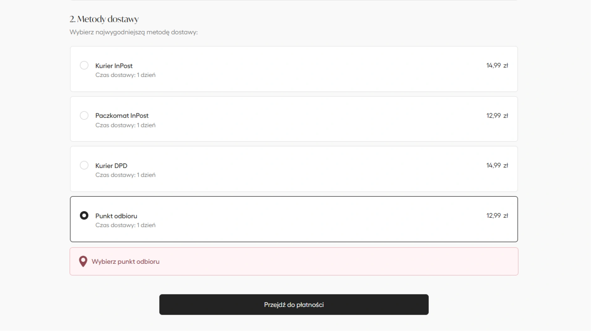
Delivery method

01
ENTRY DECISION

Account or guest checkout

Users first choose whether to sign in or continue without creating an account. The benefits and consequences of both paths are explained before moving forward.

02
DELIVERY INFORMATION

Focused address form

Contact and delivery information is grouped into one dedicated step, reducing competition with payment and shipping decisions.

03
SHIPPING DECISION

Clear delivery selection

Available delivery methods expose their cost and expected delivery time, while pickup-point selection appears only when required.

04
ORDER COMPLETION

Payment and final confirmation

The final stage keeps payment and order confirmation separate from earlier data-entry tasks, allowing users to review the purchase before completing it.

DESIGN OUTCOME

The redesigned checkout creates a more predictable sequence, reduces the amount of information shown at once and keeps the order summary available throughout the process.

09 / DELIVERY & PICKUP UX

From a Technical Map to a Practical Selection Tool

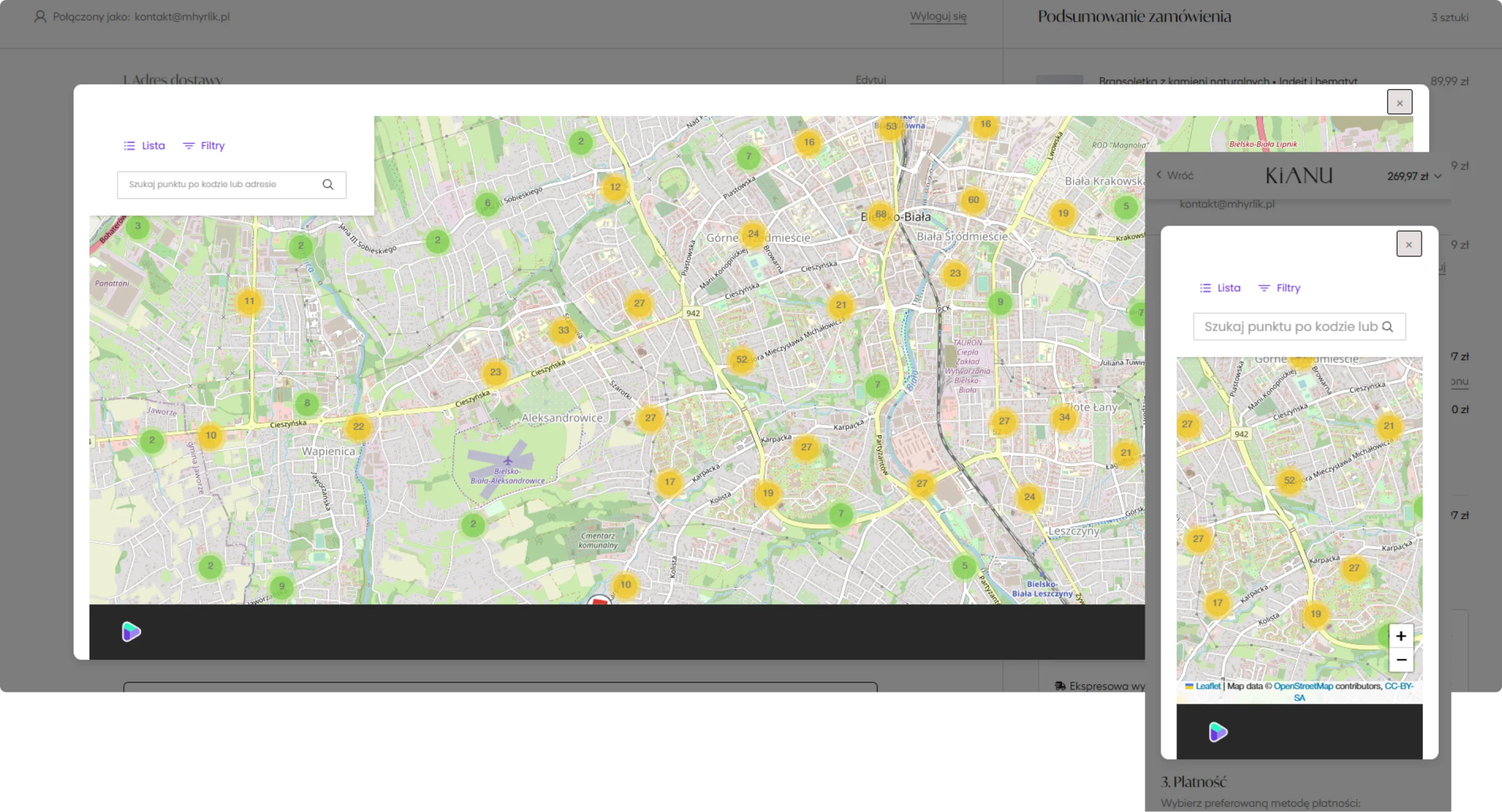
Selecting a pickup point required users to interact with an external delivery interface that felt visually disconnected from the rest of the store. The map dominated the experience, while finding and comparing nearby locations required additional effort.

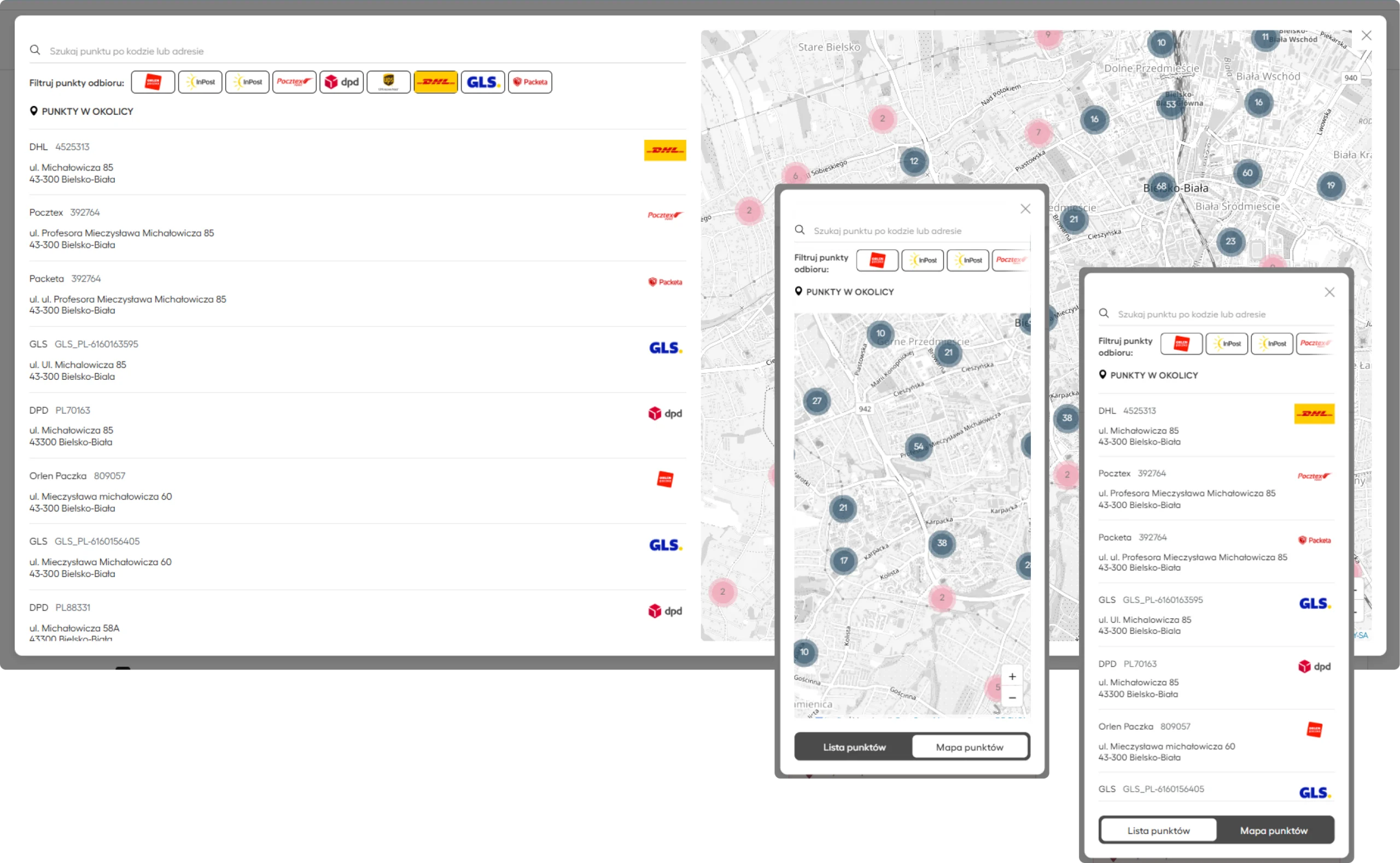
I redesigned the interface around two complementary ways of searching: a structured list for comparing details and a map for understanding location. Both views use the same controls and remain available on desktop and mobile.

BEFORE

Map-first and visually disconnected

The original interface prioritised the map while location details, filters and mobile navigation were less accessible.

AFTER

List and map working together

The redesigned selector supports searching, filtering, comparing and confirming a pickup point within one consistent interface.

BEFORE

Map-dominated pickup selector

After

Searchable list and contextual map

01

List and map modes

Users can compare addresses in a structured list or switch to the map when proximity is more important than detailed information.

02

Carrier filtering

Delivery-provider filters help narrow the available locations without requiring users to search through unrelated pickup points.

03

Responsive view switching

On mobile, the list and map become separate views controlled by a persistent switch, preserving usable space for both modes.

04

Selection confirmation

After a location is selected, its name and complete address appear directly in checkout with a clear option to change the choice.

DESIGN OUTCOME

The redesigned selector turns an external delivery component into a more consistent part of the purchase flow and makes the selected destination easier to verify before payment.

10 / OUTCOME

A More Coherent Shopping Experience, Live in Production

The redesigned components were implemented in the existing KIANU store and now form part of its live purchase experience. The work improved the connection between product discovery, personalisation, cart, delivery and checkout without rebuilding the platform from scratch.

The store owner accepted the new direction and the collaboration continues through further UX/UI and technical improvements based on current business needs.

01

More consistent journey

Key shopping stages now share a clearer hierarchy, interaction language and visual direction.

02

Reduced interface clutter

Additional options appear when needed, keeping the default product and checkout views focused on the current decision.

03

Clearer purchase decisions

Products, selected variants, delivery choices, totals and primary actions are easier to review throughout the flow.

04

Existing platform retained

Improvements were delivered within the current WooCommerce ecosystem, preserving the store’s existing content and logic.

PROJECT STATUS

Implemented and in active use

PLATFORM

WordPress and WooCommerce

DELIVERY

Production implementation

COLLABORATION

Ongoing store development

BUSINESS VALUE

The project improved high-impact parts of the shopping journey while allowing the client to continue using the existing store, integrations and operational setup.

11 / KEY LEARNINGS

What This Project Reinforced

Working on a live e-commerce store reinforced that meaningful UX improvements do not always require a complete redesign. Focused changes to high-impact moments can create a more coherent experience while respecting the existing platform and business constraints.

01

Design decisions must work in the real system

A solution is only valuable when it can coexist with the existing theme, plugins, store logic, integrations and responsive behaviour. Understanding implementation constraints helped me make more realistic design decisions.

02

Progressive disclosure protects focus

Complex options do not have to disappear, but they should appear at the right moment. Moving gift personalisation into a focused flow kept the product page simpler without removing functionality.

03

The entire journey needs one interaction language

Improving isolated screens is not enough. Product discovery, cart, delivery and checkout need consistent hierarchy, selection states and primary actions to feel like one shopping experience.

04

Implementation knowledge strengthens UX/UI work

Working across design and implementation allowed me to evaluate ideas against real content, responsive behaviour and WooCommerce constraints before releasing them to production.

The project strengthened my ability to connect UX/UI thinking, e-commerce requirements and practical implementation within an established digital product.